

Beyond the Monochrome: Mastering the "Rule of Three" Textures in Event Design

In the world of high-end event production, the "Monochrome" palette is a perennial favorite. Whether it’s an all-white spring gala that feels like a breath of fresh air or an all-black "Piano Noir" corporate launch, sticking to a single color family conveys a sense of discipline, luxury, and modernism.
However, there is a hidden danger in the monochrome approach: The Flattening Effect.
We have all seen it. You design a room that looks stunning in person, but when the professional photography comes back, the tablescapes look two-dimensional. Studies in visual perception show that the human brain can process high-contrast textures up to 60% faster than color variations alone. When your white-on-white elements bleed into each other, you lose the architectural silhouette. The result isn't "minimalist"—it’s just "flat."
To prevent this, elite designers use a specific production secret: The Rule of Three Textures.
The Challenge: The Two-Dimensional Room
When you use the same finish (e.g., all matte white or all polished black) across an entire display, the camera struggles to find "edges." Without a variation in how light hits the surfaces, the eye cannot distinguish between a platter, a riser, and the linen.
This isn't just an aesthetic issue; it's a marketing one. In the current "Content First" event economy:
-
82% of event planners state that "photogenic potential" or "Instagrammability" is a top-three priority for their clients.
-
Events with high visual depth see a 35% higher engagement rate on social media compared to flat, single-texture setups.
To create an expensive, intentional look, you don't need to add more colors. You need to add Visual Friction.
The Hack: The Rule of Three
The Rule of Three dictates that for every monochrome setup, you must mix at least three distinct finishes within that same color family. By varying the way materials interact with light, you create depth, shadow, and highlights that allow the camera—and the guest—to perceive the "layers" of the room.
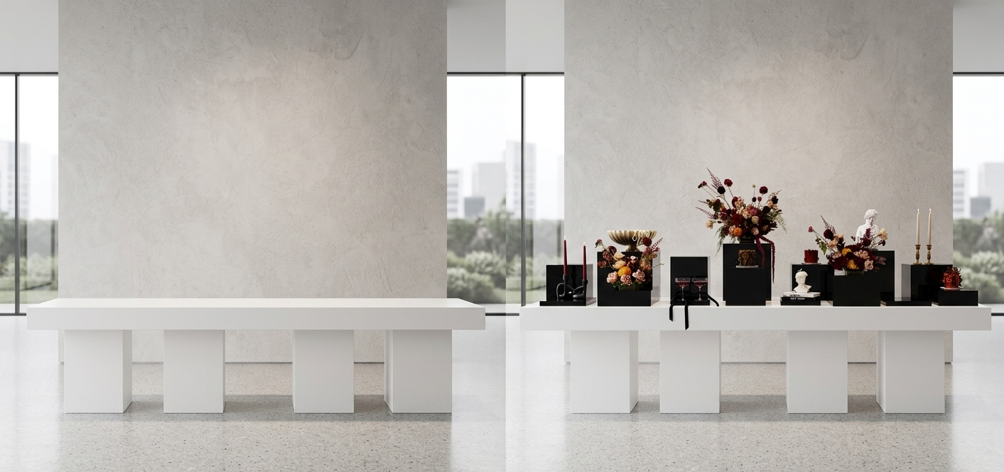
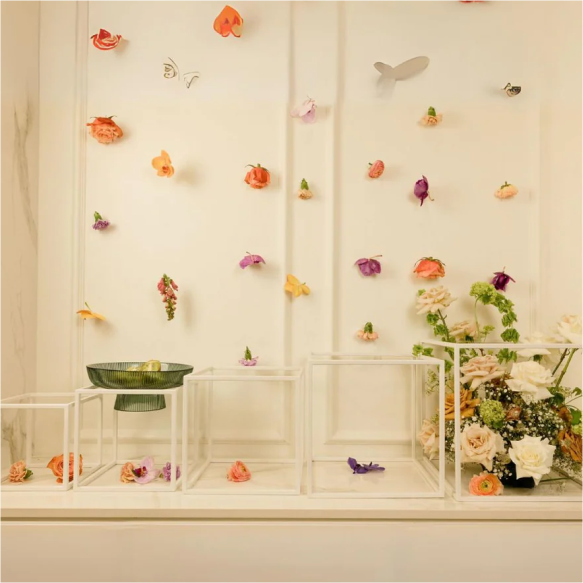
The Anatomy of a Layered Table (White Spring Gala Example)
If you are designing an all-white spring event, avoid the temptation to buy everything in a standard matte finish. Instead, layer your "Three Textures" like this:
-
The Matte Base: Use a White Rounded Platter. The matte finish provides a soft, non-reflective foundation that absorbs light. Matte surfaces absorb approximately 90% of incidental light, creating a sense of weight and calm.
-
The Architectural Detail: Elevate that platter with a White Ribbed Duo Riser. The vertical ribbing creates rhythmic shadows. These tiny lines of dark and light are what define the "height" of your display in photos.
-
The Translucent Highlight: Finish the look with a Clear Escurvé piece or a Mirrored Trio. By adding a transparent or reflective element, you introduce a "glow." Light passes through the acrylic or bounces off the mirror, creating a halo effect that separates the display from the background.
The Result: Visual Friction
When you apply the Rule of Three, you achieve Visual Friction. Even though the palette is limited to a single color, the room feels "full."
-
Matte surfaces provide the depth.
-
Ribbed/Textured surfaces provide the movement.
-
Reflective/Clear surfaces provide the spark.
This combination ensures that every pedestal, every canapé platter, and every floral riser has a distinct silhouette. Research into "Sensory Architecture" suggests that spaces with diverse tactile elements can increase guest dwell time by up to 15%, as the eye stays engaged longer exploring the various surfaces.
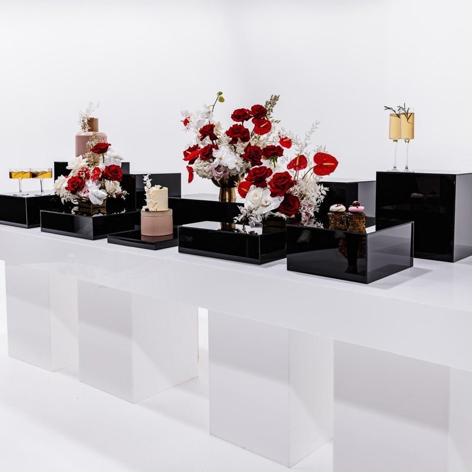
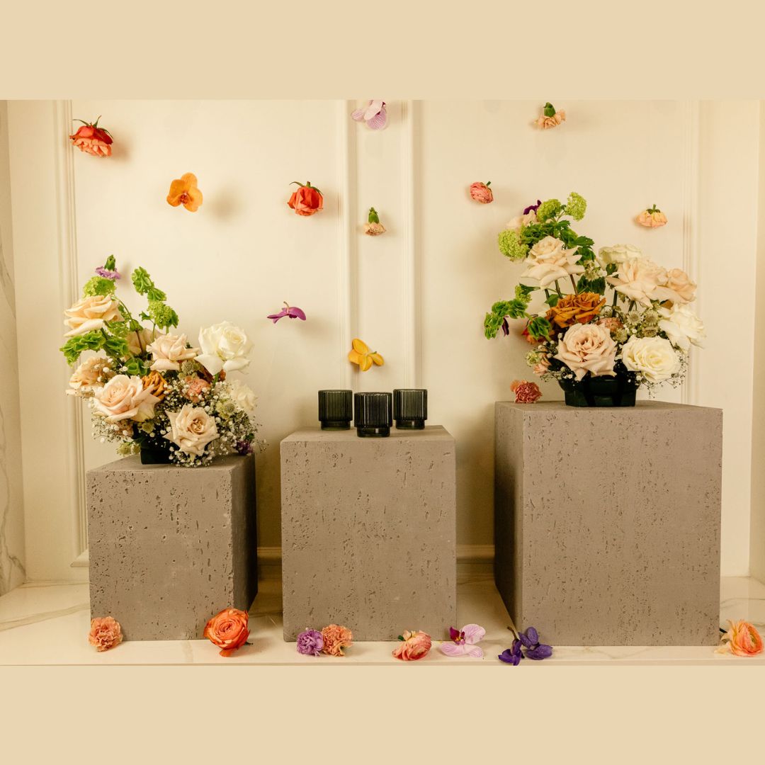
Applying the Rule Across Your Inventory
This principle isn’t just for white-tie weddings. It works across the entire Plinths spectrum:
-
The Midnight Edit: Pair our Piano Black (High Gloss) with a Matte Black Array and the organic, porous texture of Travertine.
-
The Modern Earthy Edit: Pair the Viola Collection (Natural Stone) with White Ribbed Risers (Textured) and Clear Escurvé (Reflective).
The Bottom Line
Don't just match your colors—clash your textures. When you master the Rule of Three, you stop designing "sets" and start creating "atmospheres." You give the light something to play with, and you give the camera something to capture.
